Vanguard Roboadvisor, UX Redesign
2024, Vanguard + MEJO 581
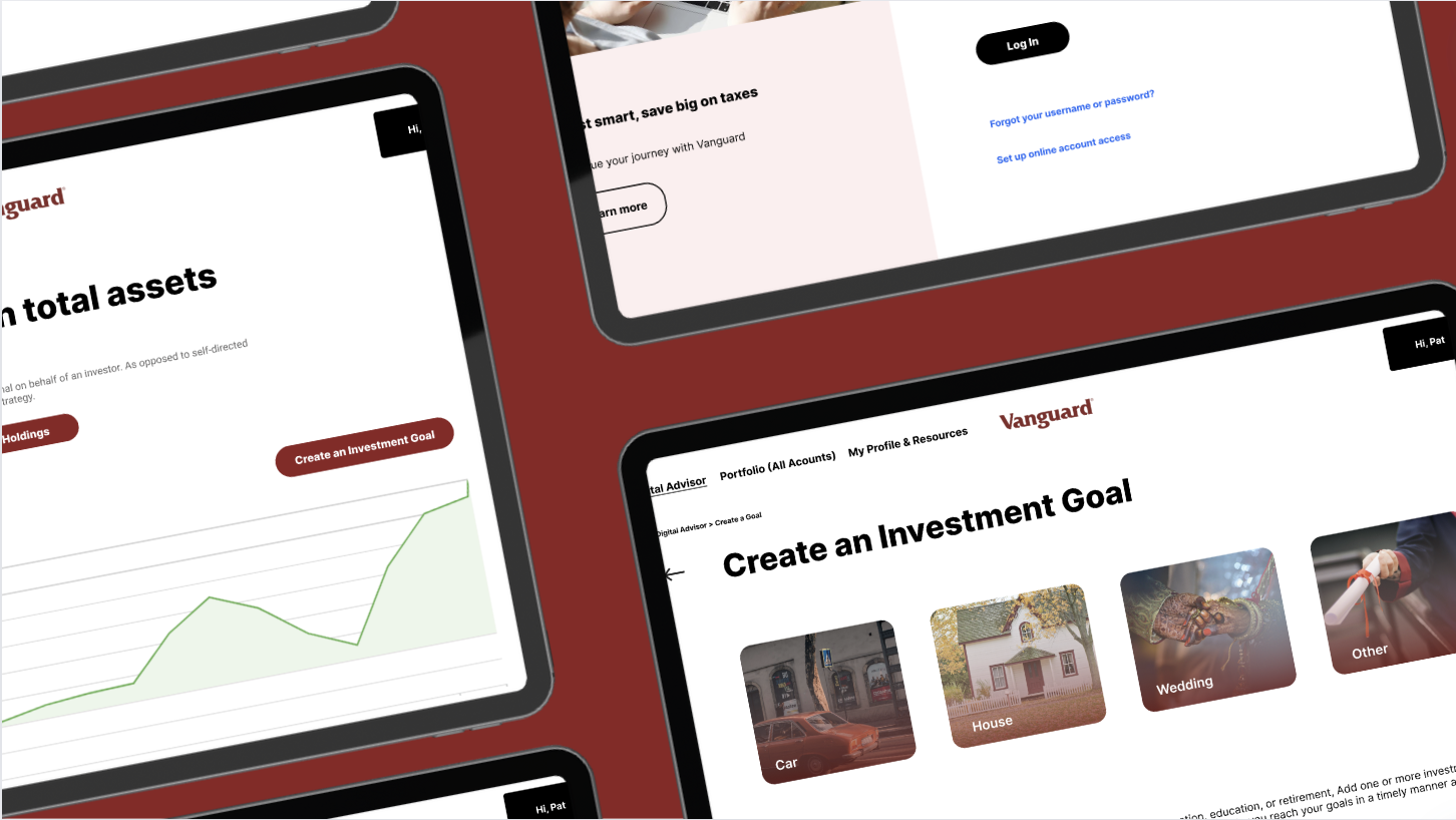
A redesign of Vanguard’s roboadvisor optimized for users new to investing

The Brief
Investing can be tricky- especially for those of us who are not financially savvy about stocks, bonds or mutual fund. In an age where information literacy is power, the question then becomes...
How do we make investing easy and accessible for young users new to investing?
The Context
For this project, my MEJO 581 course (User Experience Design and Strategy under Prof. Laura Ruel) worked throughout the duration of the semester for Vanguard (under Senior UX Designer Steven Schang) to redesign their digital roboadvisor dashboard for young users, especially those who have not invested before.
timeframe: January-May 2024
The Objective
As college students with a network of other college students who might or might not be familiar with investing, we were to serve Vanguard by understanding and living among the ideal users for this product. The success of the redesign would therefore be measured by the ability of the non-experienced users to engage with the tools of Vanguard’s roboadvisor.
Research
Questions
What do users want to look at when they log in?
What are the most important reasons they would sign up and use Digital Advisor?
What are main reasons they wouldn’t use Digital Advisor?
Methods

Findings & Goals
Simplify the navigation bar and reduce the unnecessary, redundant, and confusing pages & tabs, users tend to feel overwhelmed by too many pages
Make the dashboard feel more personalized to the specific user (with AI), especially important for Gen Z users
Prioritize learning resources for new investors, which makes for a more inclusive feel
Wireframes


High Fidelity Prototype
